Why Color Matters
In indie filmmaking, every frame counts—and so does every color. Without big budgets or star power, you rely on atmosphere and storytelling finesse to engage your audience. One of the most powerful tools at your disposal? Color theory.
Whether it’s a saturated blue that signals emotional distance or a pop of red that pulses with urgency, the right color palette can subtly (or boldly) shape how viewers feel about your story before a single word is spoken.
What Is Color Theory?
Color theory is the art and science of using color deliberately to evoke specific emotions, convey themes, and guide visual storytelling. In film, this means understanding how hue, saturation, and contrast affect mood, meaning, and viewer perception.
Think of it as emotional shorthand. When used well, color tells the audience how to feel without telling them what to think.
And it’s not just about one scene. Consistency and evolution of color across your film can heighten emotional arcs, reinforce subtext, and visually unify your entire story.
1. Understand the Emotional Power
Here’s a breakdown of common film color associations:
- Red: Passion, danger, power, anger
- Blue: Calm, coldness, isolation, melancholy
- Yellow: Energy, caution, decay, youth
- Green: Growth, envy, nature, eeriness
- Purple: Mystery, fantasy, transformation
- Black: Death, sophistication, secrecy
- White: Innocence, emptiness, sterility
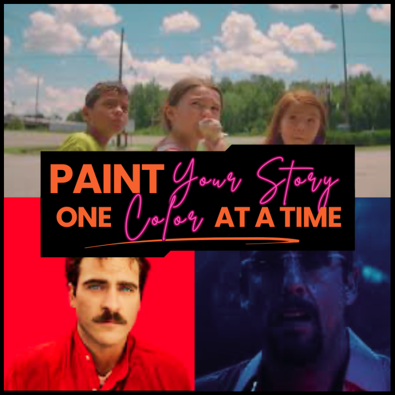
🎬 Example: In Her (2013), the soft pinks and oranges create a dreamy, intimate atmosphere, enhancing the themes of love and loneliness in a futuristic world. These color choices gently nudge the audience into feeling close to the characters’ inner emotional lives.
2. Build a Cohesive Color Palette
Your film’s color palette should feel intentional, not accidental. You’re not just picking pretty shades—you’re crafting a visual identity.
Ask yourself:
- What is the emotional tone of the story?
- Are there different emotional “chapters” that should be reflected through color shifts?
- What colors resonate with the central themes?
- Is the story grounded in realism or stylized abstraction?
Think of color as part of your storytelling toolkit—just like dialogue or camera movement. Use it to support character development, atmosphere, and narrative pacing.
3. Create Tension or Clarity
Color contrast can guide the viewer’s eye and create emphasis within a scene.
- High contrast (e.g., red on blue) can feel jarring, energetic, or dangerous.
- Low contrast (e.g., beige on cream) often feels softer or more subdued.
🎥 Example: Uncut Gems (2019) uses aggressive, saturated contrasts to heighten stress and anxiety—matching the protagonist’s spiraling life and the relentless pace of the film. The visual discomfort becomes part of the experience.
Strategically applying contrast can help you control rhythm, focus, and emotional intensity—especially useful in tense or transitional scenes.
4. Apply Color to Production Design
Color theory isn’t just for post-production. Bring your palette into every department:
- Wardrobe: Choose costumes that align with a character’s arc or psychological state.
- Production Design: Walls, furniture, and props all help reinforce your film’s visual world.
- Lighting: Gels and bulbs can subtly (or dramatically) shift tone and mood.
🎬 Example: Moonlight (2016) uses rich, expressive color in wardrobe and lighting to trace Chiron’s emotional journey across three acts. Blue dominates early scenes of vulnerability, while pinks and purples emerge later to signify identity and transformation.
Using color cohesively across departments ensures your film feels unified and emotionally resonant.
5. Reinforce Through Color Evolution
Want to deepen your storytelling? Let your color palette evolve with your character or narrative arc.
Here are some creative applications:
- A character could start in muted earth tones and shift to bold primaries as they become empowered.
- A film might begin in cold, steely blues and gradually warm up as emotional walls come down.
- A deteriorating relationship could be tracked through the draining of color—vibrancy fades as hope does.
This kind of intentional color progression gives your audience a subconscious roadmap through your story. It’s especially effective when working with minimal dialogue or exploring inner conflict.
6. Don’t Be Afraid to Break the Rules
Indie filmmaking thrives on innovation. Sometimes, intentionally breaking traditional color associations can create something fresh and emotionally complex.
💡 Example: The Florida Project (2017) uses bright, candy-colored visuals to contrast the harsh socioeconomic reality of its characters—creating a poignant sense of irony and emotional contradiction. The colors reflect the innocence of childhood, while the content confronts hard truths.
Unexpected color choices can leave a lasting impression, especially when rooted in strong storytelling.
Color: Your Secret Weapon
Before you shoot, create a color mood board that includes:
- Film stills from reference movies
- Color swatches for your chosen palette
- Lighting references or inspiration
- Wardrobe and set dressing examples
Use this as a collaborative tool with your production designer, cinematographer, and costume department. It’s a powerful way to keep everyone aligned visually.
👉 (Related: Creating Film Mood Boards That Inspire Your Crew)
Color Is Emotion
In the hands of an indie filmmaker, color isn’t just aesthetic—it’s emotional architecture. It builds mood, strengthens theme, and creates an immersive world for your audience.
When used with care, color can whisper secrets, foreshadow change, or pulse with inner turmoil. So plan your palette with intention, and let it speak where dialogue can’t.
Transformational Screenwriting
At the Independent Film Arts Academy, we believe story and visual tone go hand in hand. Our free resource, Transformational Screenwriting, helps you connect your emotional themes to every visual and narrative choice you make.

